Creating a serene environment can significantly impact your mood and overall well-being. The colours you choose for your space are crucial in establishing a calming atmosphere that fosters relaxation and creativity. Imagine stepping into a room adorned with soft, inviting hues, instantly lifting your spirits and soothing your mind. This article will guide you through selecting colours that promote tranquillity, helping you transform your home into a sanctuary of calm.
Understanding Colour Psychology
Colour psychology studies how colours influence emotions and behaviours. Different shades can evoke various feelings; for example, blue is often associated with calmness, while yellow brings warmth. Understanding these associations empowers you to make informed choices.
In your home, applying cool tones like soft blues and greens in bedrooms can promote restful sleep. Pale lavender or muted pink can create a peaceful retreat. Each space has specific functions, and the right colours can enhance their purpose. For instance, a home office might benefit from greens or blues to encourage focus, while warm neutrals create an inviting atmosphere in communal areas.
Additionally, tips for using deep winter colours can help create a comforting vibe during colder months, introducing rich hues that add warmth and depth to your surroundings.
Incorporating Inviting Hues in Your Living Spaces
Evaluating each room’s primary functions guides your colour choices. For leisure areas, consider using hues that encourage relaxation. Soft earth tones like beige or pastel greens can create a grounded feel that promotes calm conversations and quiet evenings.
Imagine a cosy corner with a plush sofa adorned with gentle cream and sage green cushions. If you enjoy reading or artistic pursuits, this setting invites relaxation and fosters creativity. Layering texture with these colours enhances the inviting feel, so consider incorporating woven materials or natural wood elements.
In kitchen spaces, brighter shades stimulate appetite and conversation. Pastel yellows or soft oranges can create a vibrant atmosphere, making meal preparations more enjoyable.
Personalising Your Colour Choices
While general colour psychology offers insights, your preferences should guide your final choices. Reflect on colours that bring you joy or evoke cherished memories. Soft pinks reminiscent of a sunset or earthy browns connecting you with nature can enhance your connection to your home.
Creating a mood board is an effective approach to personalising your choices. Collect images, fabric swatches, and colour samples that resonate with you. This process clarifies your vision and inspires you to explore authentic combinations.
Experimenting with colours doesn’t have to be daunting. Start by introducing smaller decor items, such as vases, throws, or artwork that embody the hues you love. As you become more confident, consider larger changes like repainting walls or rearranging furniture to highlight comforting shades.
Creating a Cohesive Look
A cohesive colour palette enhances the sense of calm and balance throughout your home. When rooms flow seamlessly into one another, it creates a harmonious transition. Select a few main colours and variations across different spaces, ensuring they complement each other.
For example, choose a soft blue for the living room and carry the theme into the adjoining hallway with a lighter shade. The same tones in accessories like cushions, rugs, and artwork can also tie the look together. This thoughtful approach enhances the aesthetic and reinforces the calming atmosphere you aim to create.
The Role of Lighting in Colour Perception
Lighting is crucial in how colours appear in your space. Natural light can alter the perception of colour throughout the day. For instance, a room that looks warm and inviting during the day might feel different in the evening under artificial lighting.
You have more flexibility with colour choices in spaces with abundant natural light. Lighter shades create an airy feel, while bolder hues add depth. Opting for lighter colours can enhance brightness and openness in areas with limited natural light. Using a combination of light sources, such as floor lamps and wall sconces, can influence ambience and highlight your chosen colours.
Seasonal Adjustments for a Refreshing Atmosphere
Changing your colour schemes with the seasons creates a refreshing atmosphere. During spring and summer, consider introducing brighter, more vibrant shades that evoke feelings of joy. Incorporate lively greens and sunny yellows to reflect the season’s warmth.
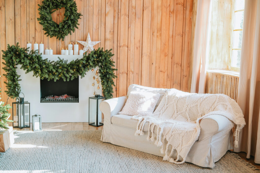
In autumn, earth tones like rust, deep greens, and warm neutrals create a comforting environment that complements the changing weather. When winter arrives, transitioning to soft whites, icy blues, or muted pastels can evoke tranquillity.
Focus on smaller decor items that can be easily swapped out, such as cushions, throws, or artwork. This approach allows you to refresh your space without a complete overhaul, making subtle shifts profoundly impact how your home feels.
Incorporating Nature-Inspired Hues
Bringing elements of nature into your colour choices enhances the calming effect of your space. Nature-inspired colours, including greens, browns, and soft blues, foster a connection to the outdoors. Consider incorporating natural materials like wood, stone, and live plants to complement your colour palette.
A green feature wall adorned with tasteful botanical prints or nature photography can create a peaceful oasis. Houseplants beautify your space and purify the air, enhancing your mood. Blending natural hues with elements of nature within your decor can greatly improve the calming atmosphere and promote a sense of well-being.
Textures and Patterns to Enhance Calmness
In addition to colour, textures and patterns can significantly affect a space’s atmosphere. Soft fabrics, such as plush cushions, blankets, and rugs, provide comfort and warmth. Use natural materials like cotton, linen, and wool to create an inviting environment.
Incorporating patterns can bring visual interest without overwhelming the senses. Choose subtle designs that use your chosen colour palette to maintain a cohesive look. For instance, a delicate floral pattern in soft pastels can enhance a serene vibe, while geometric patterns in muted tones add modernity to your space. Combining textures and patterns with your colour choices can create depth and character while maintaining an overall sense of calm.
By intentionally selecting and applying inviting hues, you can transform your living spaces into refreshing sanctuaries that promote relaxation and mental clarity. Explore colour choices that resonate with your personal experiences and embrace the peaceful environment that follows.